CoaguChek: Designing for Independence
Overview
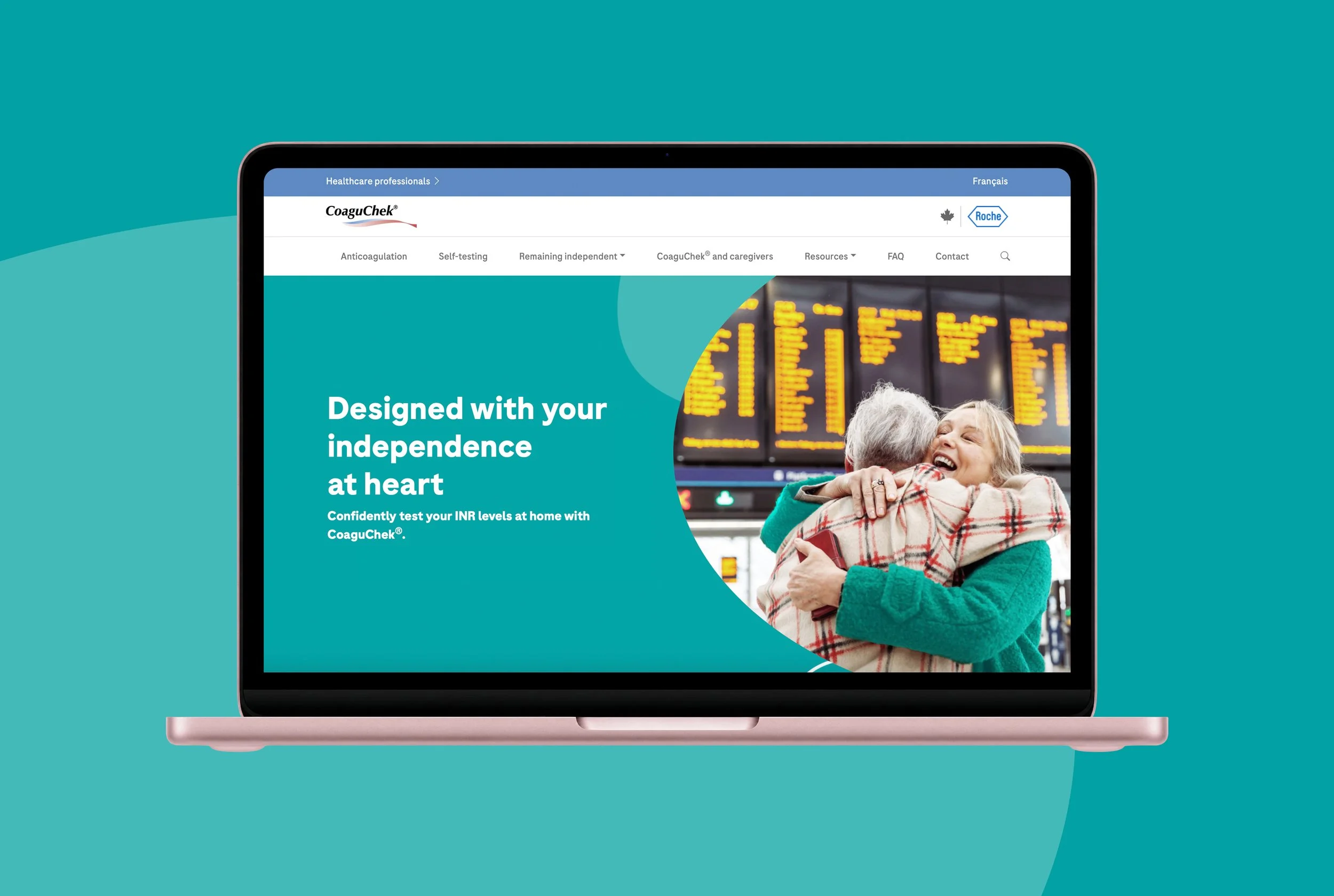
The CoaguChek website redesign focused on creating a more intuitive, accessible, and visually engaging digital experience for its users. With a core audience aged 55+, the goal was to simplify navigation, improve information clarity, and reinforce the brand’s promise of independence and support for patients managing their health.
The problem
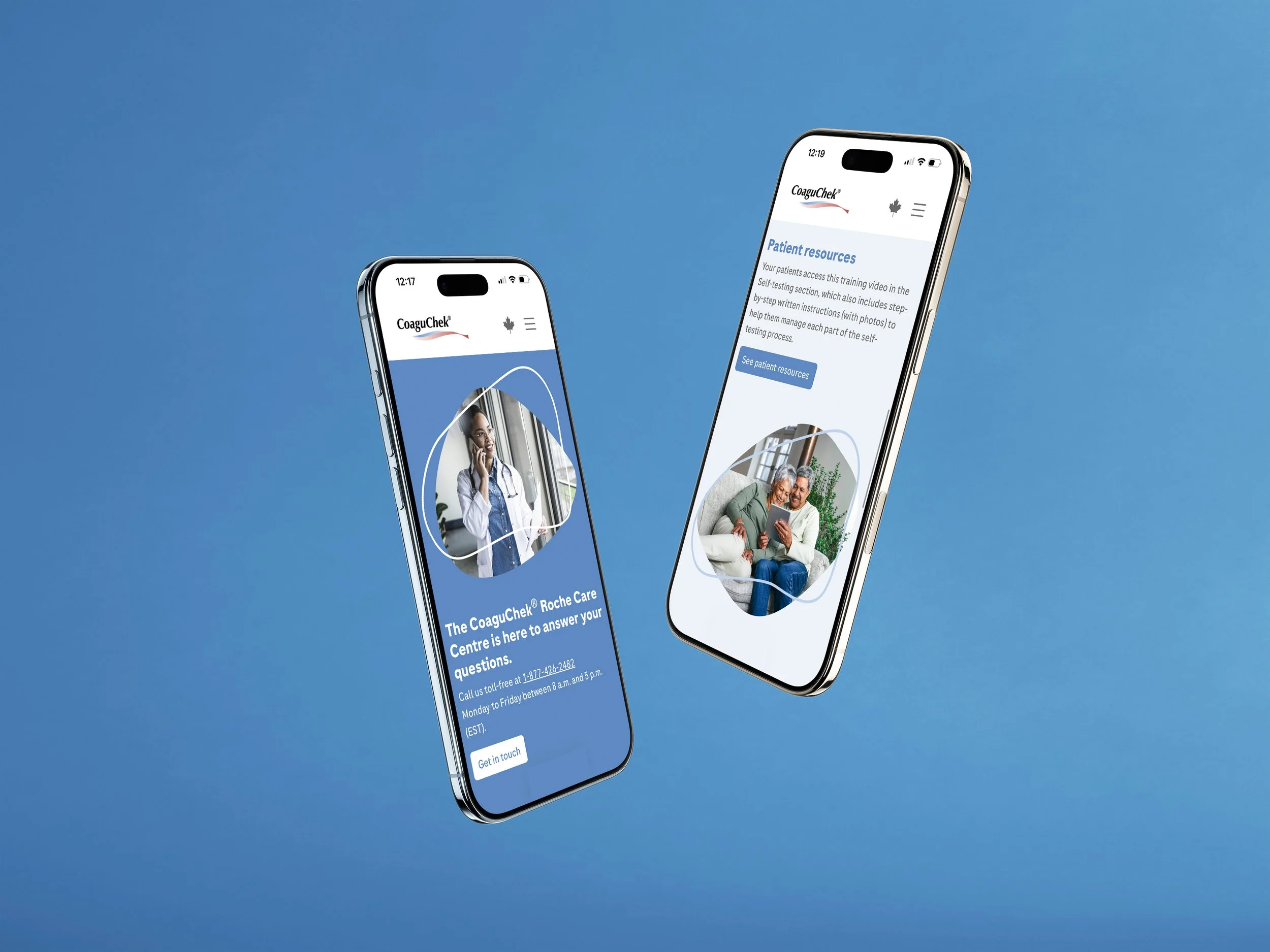
The existing website was difficult to navigate, with information that wasn’t easily accessible for its primary audience. The user journey lacked clarity, making it challenging for patients to find what they needed quickly. Additionally, the visual design felt outdated and didn’t fully reflect the lived realities of its Canadian audience. With two distinct user groups, patients and healthcare professionals, the site also needed clearer segmentation without sacrificing cohesion.
The Idea
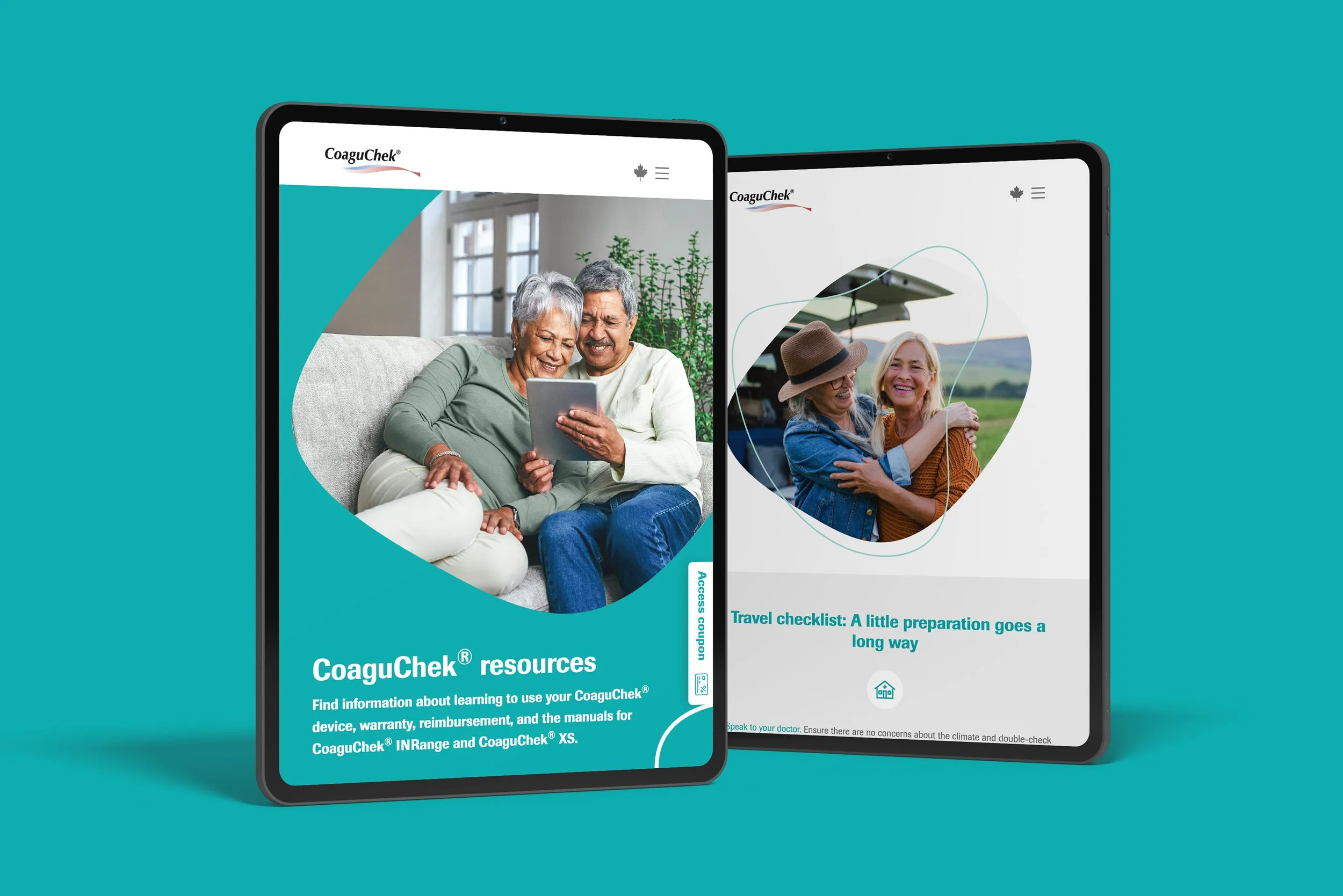
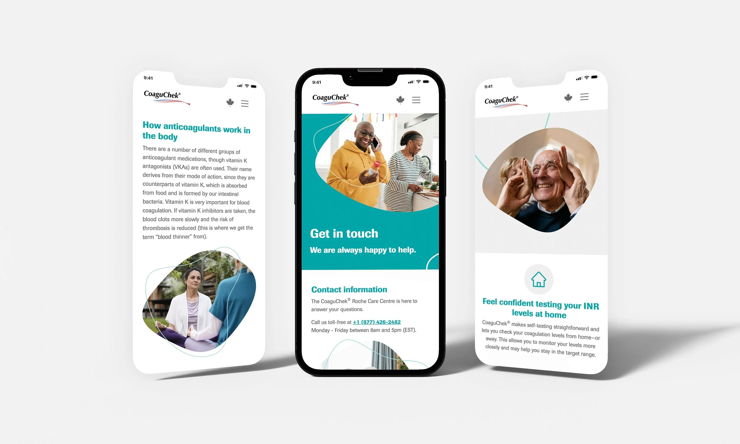
The idea was to completely rethink the site structure and user flow, creating a seamless and intuitive experience for both audiences. This meant simplifying navigation, prioritizing key information, and introducing a refreshed visual language that felt human, inclusive, and supportive. The design needed to balance clarity with warmth; functional, yet engaging.
My role
As Senior Digital Art Director, I led the visual direction of the project, working closely with UX designers and copywriters to bring the experience to life. Using the existing brand as a foundation, I helped shape a design system that improved usability while elevating the overall look and feel. A key part of my role was ensuring the site felt accessible and inclusive, while also creating a strong visual narrative that supported the user journey from start to finish.
The solution
We reworked the site architecture to create clearer pathways and more intuitive navigation, helping users find information quickly and confidently. Both patient and healthcare professional sections were thoughtfully designed to feel tailored yet cohesive. Visually, we introduced organic shapes to add depth and soften the interface, alongside curved lines around talent to bring a more human, supportive feel. Updated imagery better reflects Canadian diversity and everyday life. The result is a modern, accessible website that improves usability while feeling inclusive, engaging, and true to the brand’s promise of independence.