Turning ‘Mammogram’ Into a Message Women Can Embrace

Project overview
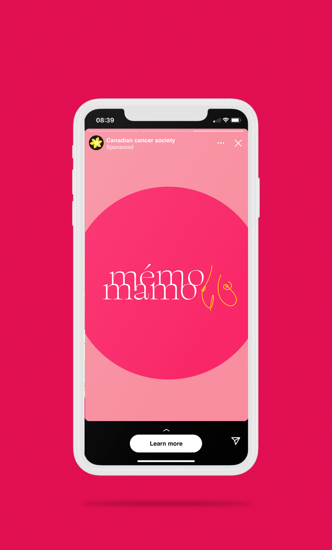
As Senior Digital Art Director at Lemieux Bédard, I led the creative revival of the Mémo-Mamo campaign in its 12th year. Following a two-year hiatus, we reintroduced the campaign with a completely refreshed look and feel, encouraging women to get mammograms through positive, fact-based messaging.
The problem
After a two-year break, the campaign needed to reconnect with its audience in a meaningful way. Breast cancer is a sensitive and often daunting subject, and previous messaging risked feeling clinical or fear-based. The challenge was to re-engage a broad audience while making the topic feel approachable, relevant, and motivating.
The Idea
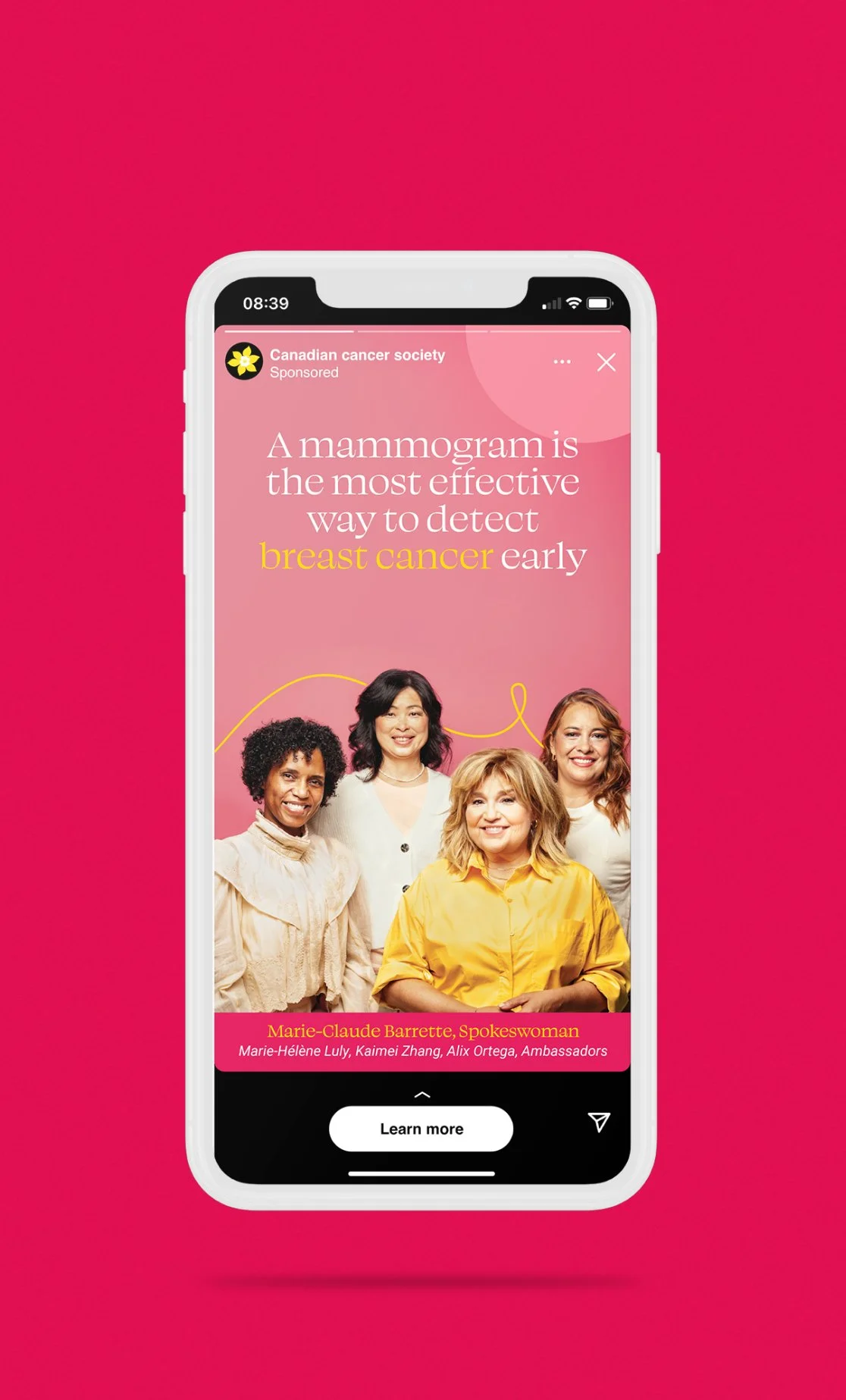
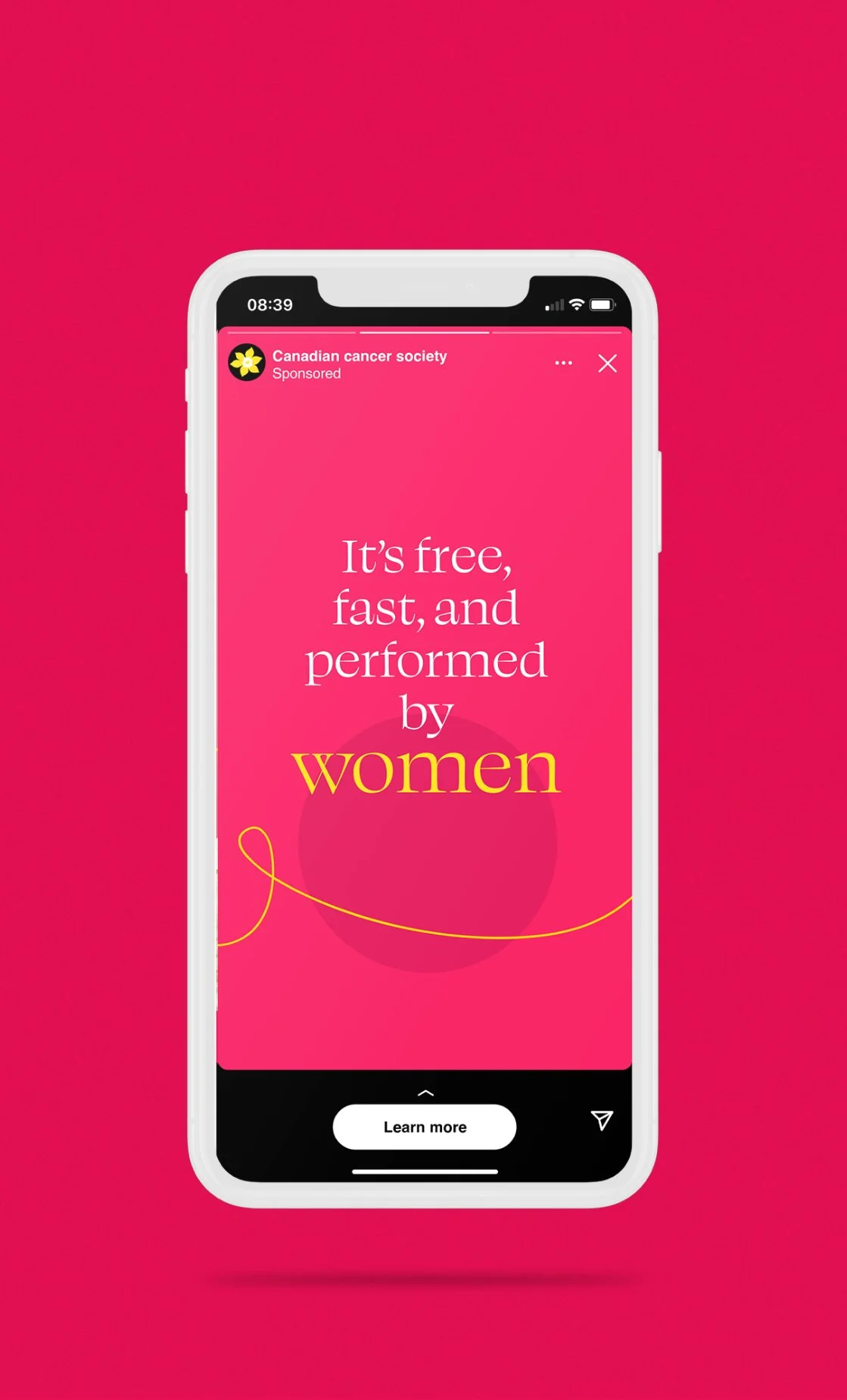
We shifted to a more emotional tone grounded in facts, focusing on the positive impact of early detection. The idea was to balance empathy with credibility—creating a campaign that felt human, supportive, and empowering, while still delivering clear and trustworthy information.
My Role
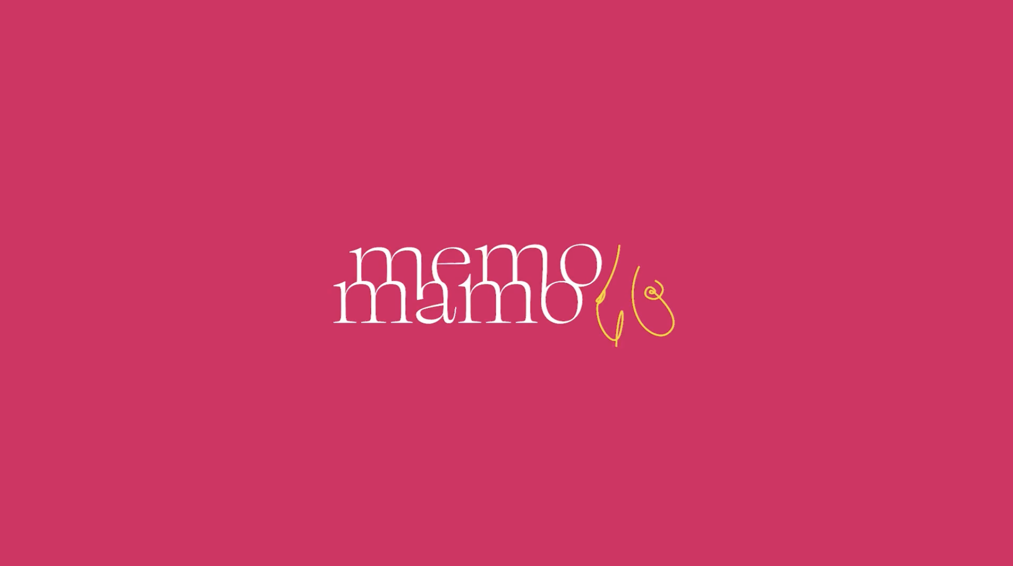
I led the visual direction of the campaign, selecting colours, designing the logo, and defining the typography to create a warm, approachable identity. I worked closely with the broader team to ensure the creative aligned with the messaging, while maintaining a strong, cohesive look and feel across all touchpoints.

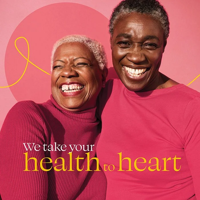
We developed a vibrant, welcoming visual identity that softened the weight of the subject while encouraging engagement. Hand-drawn line elements added a human, personal touch, reinforcing a sense of care and connection throughout the campaign.
Inclusivity was central to the approach. Colours, photography, and messaging were carefully selected to reflect diverse communities, ensuring the campaign felt accessible, representative, and relevant to a broad audience.
The result was a refreshed campaign that reconnected with its audience in a meaningful way, shifting the conversation from fear to empowerment. By balancing emotional storytelling with factual messaging, the campaign strengthened engagement and helped drive awareness around the importance of early detection.
The Solution